Introduction
You might have heard of android Material Design which was introduced in Android Lollipop version. In Material Design lot of new things were introduced like Material Theme, new widgets, custom shadows, vector drawables and custom animations.
Surprisingly that it was not easy to implement Material Design in android application because those Material Design's UI Component like Floating Action Button (FAB) wasn't available in Android pre-Lollipop. Only choice we had was to use 3rd party library.
Here comes a good news. Last week during Google I/O 2015 event, Google announced the most excited support library within year named Android Design Support Library providing a bunch of useful Material Design UI Components in a single library. Let me use this chance to describe to you one by one how to use each of them through this article.
- AppCompatAutoCompleteTextView
- AppCompatButton
- AppCompatCheckBox
- AppCompatCheckedTextView
- AppCompatEditText
- AppCompatMultiAutoCompleteTextView
- AppCompatRadioButton
- AppCompatRatingBar
- AppCompatSpinner
- AppCompatTextView
Basic Material Design Template
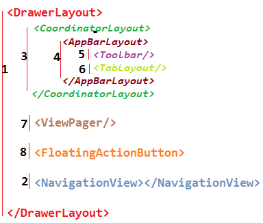
Basic Material Design Template
<android.support.design.widget.CoordinatorLayout
    xmlns:android="http://schemas.android.com/apk/res/android"
    xmlns:app="http://schemas.android.com/apk/res-auto"
    android:layout_width="match_parent"
    android:layout_height="match_parent"
    android:fitsSystemWindows="true">

    <android.support.design.widget.AppBarLayout
        android:id="@+id/app_bar_layout"
        android:layout_width="match_parent"
        android:layout_height="wrap_content"
        android:theme="@style/ThemeOverlay.AppCompat.Dark.ActionBar"
        android:fitsSystemWindows="true">

        <android.support.design.widget.CollapsingToolbarLayout
            android:id="@+id/collapsing_toolbar"
            android:layout_width="match_parent"
            android:layout_height="match_parent"
            app:layout_scrollFlags="scroll|exitUntilCollapsed"
            app:contentScrim="?attr/colorPrimary"
            app:expandedTitleMarginStart="48dp"
            app:expandedTitleMarginEnd="64dp"
            android:fitsSystemWindows="true">

            <com.antonioleiva.materializeyourapp.widgets.SquareImageView
                android:id="@+id/image"
                android:layout_width="match_parent"
                android:layout_height="wrap_content"
                android:scaleType="centerCrop"
                android:fitsSystemWindows="true"
                app:layout_collapseMode="parallax"/>

            <android.support.v7.widget.Toolbar
                android:id="@+id/toolbar"
                android:layout_width="match_parent"
                android:layout_height="?attr/actionBarSize"
                app:popupTheme="@style/ThemeOverlay.AppCompat.Light"
                app:layout_collapseMode="pin" />

        </android.support.design.widget.CollapsingToolbarLayout>

    </android.support.design.widget.AppBarLayout>

    <android.support.v4.widget.NestedScrollView
        android:id="@+id/scroll"
        android:layout_width="match_parent"
        android:layout_height="match_parent"
        android:clipToPadding="false"
        app:layout_behavior="@string/appbar_scrolling_view_behavior">

        <FrameLayout
            android:layout_width="match_parent"
            android:layout_height="wrap_content">

            <android.support.v7.widget.CardView
                android:layout_width="match_parent"
                android:layout_height="wrap_content"
                android:layout_marginTop="24dp"
                app:cardElevation="@dimen/spacing_medium"
                app:cardUseCompatPadding="true">

                <LinearLayout
                    android:layout_width="match_parent"
                    android:layout_height="wrap_content"
                    android:orientation="vertical">

                    <TextView
                        android:id="@+id/title"
                        android:layout_width="match_parent"
                        android:layout_height="wrap_content"
                        android:layout_marginLeft="@dimen/spacing_large"
                        android:layout_marginRight="@dimen/spacing_large"
                        android:layout_marginTop="@dimen/spacing_large"
                        android:textAppearance="@style/TextAppearance.AppCompat.Headline"/>

                    <TextView
                        android:id="@+id/description"
                        android:layout_width="match_parent"
                        android:layout_height="wrap_content"
                        android:layout_margin="@dimen/spacing_large"
                        android:text="@string/lorem_ipsum"
                        android:textAppearance="@style/TextAppearance.AppCompat.Body1"/>

                </LinearLayout>

            </android.support.v7.widget.CardView>

        </FrameLayout>

    </android.support.v4.widget.NestedScrollView>

    <android.support.design.widget.FloatingActionButton
        android:id="@+id/fab"
        app:layout_anchor="@id/app_bar_layout"
        app:layout_anchorGravity="bottom|right|end"
        style="@style/FabStyle"/>

</android.support.design.widget.CoordinatorLayout>