Introduction
Android Componets
UserInterface
Advanced UI
Data Storage
Advanced Concepts
Others
New Studio
- Android User Interface
- 3.1 Introduction(Nano)
- 3.2 Layouts(Nano)
- -- LinearLayout(Nano)
- -- RelativeLayout(Nano)
- -- TableLayout(Mega)
- -- Frame Layout(Mega)
- --
Absolute Layout - -- Grid Layout(Mega)
- 3.3 UI Widgets (Nano)
- -- TextView(Nano)
- -- EditText(Nano)
- -- Button(Nano)
- -- Event Handler(Nano)
- -- Image Buttons(Nano)
- -- CheckBox(Nano)
- -- Dialog(Nano)
- -- RadioGroup & RadioButtons(Nano)
- -- Toast(Nano)
- -- RatingBar(Nano)
- -- SeekBar(Nano)
- -- ProgerssBar(Nano)
- -- ToggleButton(Nano)
- -- WebView(Nano)
- -- Spinner(Nano)
- -- Layout Inflator(Mega)
- -- ListView and Adapters(Mega)
- -- Gridview(Mega)
- 3.4 Android Resources(Nano)
- -- Resource Introduction(Nano)
- -- Animation Resources(Mega)
- -- Color State List Resource(Mega)
- -- Drawable Resources(Mega)
- -- Layout Resource(Nano)
- -- String Resources(Nano)
- -- Style Resource(Mega)
- -- Supporting Multiple Screens(Mega)
- -- Practises
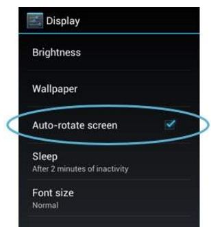
Android Checkbox Control
A checkbox is a specific type of two-states button that can be either checked or unchecked.
Syntax :
<CheckBox
        android:layout_width="wrap_content"
        android:layout_height="wrap_content"
        android:layout_gravity="center_horizontal"
        android:text="Registration"
        android:checked="true"
        android:textColor="#FFF"
        android:textSize="18sp"
        android:textStyle="bold" />
CheckBox Attributes
| Attribute | Description |
|---|---|
| android:id | This is the ID which uniquely identifies the control. |
| android:text | Text to display. |
| android:textAllCaps | Present the text in ALL CAPS. Possible value either true or false. |
| android:textColor | Text color. May be a color value, in the form of #rgb, #argb, #rrggbb, or #aarrggbb. |
| android:textSize | Size of the text. Recommended dimension type for text is sp for scaled-pixels (example: 15sp). |
| android:textStyle | Style (bold, italic, bolditalic) for the text. You can use or more of the following values separated by '|'. |
| android:typeface | Typeface (normal, sans, serif, monospace) for the text. You can use or more of the following values separated by '|'. |
| android:checked | Indicates the initial checked state of this text. |