- Android User Interface
- 3.1 Introduction(Nano)
- 3.2 Layouts(Nano)
- -- LinearLayout(Nano)
- -- RelativeLayout(Nano)
- -- TableLayout(Mega)
- -- Frame Layout(Mega)
- --
Absolute Layout - -- Grid Layout(Mega)
- 3.3 UI Widgets (Nano)
- -- TextView(Nano)
- -- EditText(Nano)
- -- Button(Nano)
- -- Event Handler(Nano)
- -- Image Buttons(Nano)
- -- CheckBox(Nano)
- -- Dialog(Nano)
- -- RadioGroup & RadioButtons(Nano)
- -- Toast(Nano)
- -- RatingBar(Nano)
- -- SeekBar(Nano)
- -- ProgerssBar(Nano)
- -- ToggleButton(Nano)
- -- WebView(Nano)
- -- Spinner(Nano)
- -- Layout Inflator(Mega)
- -- ListView and Adapters(Mega)
- -- Gridview(Mega)
- 3.4 Android Resources(Nano)
- -- Resource Introduction(Nano)
- -- Animation Resources(Mega)
- -- Color State List Resource(Mega)
- -- Drawable Resources(Mega)
- -- Layout Resource(Nano)
- -- String Resources(Nano)
- -- Style Resource(Mega)
- -- Supporting Multiple Screens(Mega)
- -- Practises
Android Drawables
A 'Drawable' resource is a general concept for a graphic which can be drawn.
Every Drawable is stored as individual files in one of the res/drawable folders.Typically you would store bitmaps for different resolutions in the -mdpi, -hdpi, -xhdpi, -xxhdpi subfolders of res/drawable.The ADT project creation wizard creates these folders by default. If these bitmaps are provided in different folder, the Android system selects the correct one automatically based on the device configuration.
In addition to graphical files, Android supports XML drawables and 9-patch graphics. XML drawables are used to describe shapes (color, border, gradient), state, transitions and more.
9-patch graphics are used to define which part of a graphic should be stretched if the view which uses this graphic is larger than the graphic.Drawables can also be written in Java code. Every object which implements Drawable can be used as a Drawable in code.
Using drawables for views
Drawables are referred to in XML via @drawable/filename whereby filename filename is the filename without the file extension. For example to access the res/drawable/hello.png Drawable, you would use @drawable/hello as demonstrated in the following snippet.
<TextView xmlns:android="http://schemas.android.com/apk/res/android"
    android:id="@+id/textView1"
    android:layout_width="wrap_content"
    android:layout_height="wrap_content"
    android:background="@drawable/hello"
    android:text="@string/hello_world" />
In code you can also assign drawables to views. Most views accept an resource ID as input parameter. For example the following code shows how to set a drawables as background to an ImageView.
ImageView imageView = (ImageView) findViewById(R.id.image);
imageView.setImageResource(R.drawable.hello);
Shape Drawables
- Shape Drawables are XML files which allow to define a geometric object with colors, borders and gradients which can get assigned to Views.
- The advantage of using XML Shape Drawables is that they automatically adjust to the correct size.
res/drawable/myshape.xml
<?xml version="1.0" encoding="UTF-8"?>
<shape
  xmlns:android="http://schemas.android.com/apk/res/android"
  android:shape="rectangle">
  <stroke
    android:width="2dp"
    android:color="#FFFFFFFF" />
  <gradient
    android:endColor="#DDBBBBBB"
    android:startColor="#DD777777"
    android:angle="90" />
  <corners
    android:bottomRightRadius="7dp"
    android:bottomLeftRadius="7dp"
    android:topLeftRadius="7dp"
    android:topRightRadius="7dp" />
</shape>
You could assign that drawable to the background property of your layout.
<?xml version="1.0" encoding="utf-8"?>
<LinearLayout xmlns:android="http://schemas.android.com/apk/res/android"
    android:layout_width="match_parent"
    android:layout_height="match_parent"
    android:background="@drawable/myshape"
    android:orientation="vertical">
.
.
.
.
.
.
.
.
.
</LinearLayout>
State Drawables
State drawables allow to define states. For each state a different drawable can get assigned to the View. For example the following defines different drawables for a button depending on its state.
<?xml version="1.0" encoding="utf-8"?>
<selector xmlns:android="http://schemas.android.com/apk/res/android">

  <item android:drawable="@drawable/button_pressed"
    android:state_pressed="true" />
  <item android:drawable="@drawable/button_checked"
    android:state_checked="true" />
  <item android:drawable="@drawable/button_default" />

</selector>
9 Patch Drawables
The ADT supplies the draw9patch program in the android-sdk/tools installation folder, which makes it easy to create 9 Patch drawables.Gradient Drawables
In android, we can create Gradient drawable and use them as background resource for TextViews, Buttons, ListView etc. Gradient helps to make the the GUI better and stylish.1st Gradient Drawable : Darker to Lighter shade

1. res/drawable/gradient_drawable1.xml
<?xml version="1.0" encoding="utf-8"?>
<selector xmlns:android="http://schemas.android.com/apk/res/android">
    <item>
        <shape>
            <gradient
                android:startColor="#4C4C43"
                android:endColor="#B8B894"
                android:angle="270" />
        </shape>
    </item>
</selector>
2nd Gradient Drawable : Lighter to Darker shade

2. res/drawable/gradient_drawable2.xml
<?xml version="1.0" encoding="utf-8"?> <selector xmlns:android="http://schemas.android.com/apk/res/android"> <item> <shape> <gradient android:startColor="#B8B894" android:endColor="#4C4C43" android:angle="270" /> </shape> </item> </selector>
3rd Gradient Drawable : Darker at Boundaries and Lighter in center

3. res/drawable/gradient_drawable3.xml
<?xml version="1.0" encoding="utf-8"?>
<selector xmlns:android="http://schemas.android.com/apk/res/android">
    <item>
        <shape>
            <gradient
                android:startColor="#4C4C43"
                android:centerColor="#B8B894"
                android:endColor="#4C4C43"
                android:angle="270" />
        </shape>
    </item>
</selector>
In below layout I have used these gradient drawable as background resource of Button.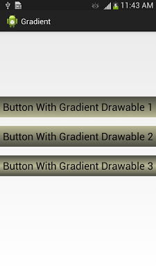
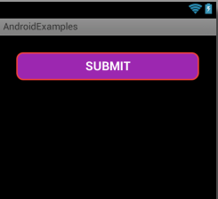
Solid Drawables
In res/drawable/solid_bg.xml
<?xml version="1.0" encoding="utf-8"?>
<shape xmlns:android="http://schemas.android.com/apk/res/android" >

    <stroke
        android:width="2dp"
        android:color="#F44336" />

    <padding
        android:bottom="7dp"
        android:left="7dp"
        android:right="7dp"
        android:top="7dp" />

    <corners android:radius="25dp" />

    <solid android:color="#9C27B0" />

</shape>
In main_activity.xml
<LinearLayout xmlns:android="http://schemas.android.com/apk/res/android"
    xmlns:tools="http://schemas.android.com/tools"
    android:layout_width="match_parent"
    android:layout_height="match_parent"
    android:background="#000"
    android:orientation="vertical"
    android:padding="25dp" >

    <Button
        android:layout_width="match_parent"
        android:layout_height="wrap_content"
        android:background="@drawable/solid_bg"
        android:padding="10dp"
        android:textSize="18sp"
        android:textStyle="bold"
        android:text="SUBMIT"
        android:textColor="#FFF" />

</LinearLayout>
Drawable Lines
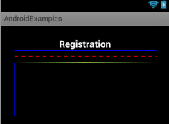
res/drawable/dotted_line.xml
<shape xmlns:android="http://schemas.android.com/apk/res/android"
    android:shape="line" >

    <stroke
        android:dashGap="10px"
        android:dashWidth="10px"
        android:width="1dp"
        android:color="#F00" />

</shape>
res/drawable/gradient_lines.xml
<?xml version="1.0" encoding="utf-8"?>
<shape xmlns:android="http://schemas.android.com/apk/res/android"
    android:shape="rectangle" >

    <gradient
        android:angle="0"
        android:centerColor="#97CF4D"
        android:endColor="#000000"
        android:startColor="#000000" />

</shape>
res/layout/activity_main.xml
<LinearLayout xmlns:android="http://schemas.android.com/apk/res/android"
    xmlns:tools="http://schemas.android.com/tools"
    android:layout_width="match_parent"
    android:layout_height="match_parent"
    android:background="#000"
    android:orientation="vertical"
    android:padding="25dp" >

    <TextView
        android:layout_width="wrap_content"
        android:layout_height="wrap_content"
        android:layout_gravity="center_horizontal"
        android:text="Registration"
        android:textColor="#FFF"
        android:textSize="18sp"
        android:textStyle="bold" />

    <View
        android:layout_width="fill_parent"
        android:layout_height="1dp"
        android:background="#FF0000FF" />
     <View
        android:layout_width="fill_parent"
        android:layout_height="2dp"
        android:layout_marginTop="10dp"
        android:background="@drawable/dotted_line" />
      <View
        android:layout_width="fill_parent"
        android:layout_height="1dp"
        android:layout_marginTop="10dp"
        android:background="@drawable/gradient_lines" />

   <View
        android:layout_width="2dp"
        android:layout_height="100dp"
        android:background="#FF0000FF" />

</LinearLayout>
Drawables Types
A drawable resource is a general concept for a graphic that can be drawn to the screen.There are several different types of drawables:| Type | Description |
|---|---|
| Bitmap File | A bitmap graphic file (.png, .jpg, or .gif). |
| Nine-Patch File | A PNG file with stretchable regions to allow image resizing based on content (.9.png). |
| Layer List | A Drawable that manages an array of other Drawables. These are drawn in array order, so the element with the largest index is be drawn on top. |
| State List | An XML file that references different bitmap graphics for different states (for example, to use a different image when a button is pressed). |
| Level List | An XML file that defines a drawable that manages a number of alternate Drawables, each assigned a maximum numerical value. |
| Transition Drawable | An XML file that defines a drawable that can cross-fade between two drawable resources. |
| Inset Drawable | An XML file that defines a drawable that insets another drawable by a specified distance. This is useful when a View needs a background drawble that is smaller than the View's actual bounds. |
| Clip Drawable | An XML file that defines a drawable that clips another Drawable based on this Drawable's current level value. |
| Scale Drawable | An XML file that defines a drawable that changes the size of another Drawable based on its current level value. |
| Shape Drawable | An XML file that defines a geometric shape, including colors and gradients. |
Bitmap - Drawable
A bitmap image. Android supports bitmap files in three formats: .png (preferred), .jpg (acceptable), .gif (discouraged).You can reference a bitmap file directly, using the filename as the resource ID, or create an alias resource ID in XML.
Note: Bitmap files may be automatically optimized with lossless image compression by the aapt tool during the build process. If you plan on reading an image as a bit stream in order to convert it to a bitmap, put your images in the res/raw/ folder instead, where they will not be optimized.
1. Bitmap File
A bitmap file is a .png, .jpg, or .gif file. Android creates a Drawable resource for any of these files when you save them in theres/drawable/ directory.FILE LOCATION:
res/drawable/filename.png (.png, .jpg, or .gif)(The filename is used as the resource ID.)RESOURCE REFERENCE:
In Java: R.drawable.filename
In XML: @[package:]drawable/filename
EXAMPLE
With an image saved at
res/drawable/myimage.png, this layout XML applies the image to a View:
<ImageView
    android:layout_height="wrap_content"
    android:layout_width="wrap_content"
    android:src="@drawable/myimage" />
The following application code retrieves the image as a Drawable:
Resources res = getResources();
Drawable drawable = res.getDrawable(R.drawable.myimage);
2. XML Bitmap
An XML bitmap is a resource defined in XML that points to a bitmap file. The effect is an alias for a raw bitmap file. The XML can specify additional properties for the bitmap such as dithering and tiling.FILE LOCATION:
res/drawable/filename.xmlSYNTAX :
<?xml version="1.0" encoding="utf-8"?>
<bitmap
    xmlns:android="http://schemas.android.com/apk/res/android"
    android:src="@[package:]drawable/drawable_resource"
    android:antialias=["true" | "false"]
    android:dither=["true" | "false"]
    android:filter=["true" | "false"]
    android:gravity=["top" | "bottom" | "left" | "right" | "center_vertical" |
                      "fill_vertical" | "center_horizontal" | "fill_horizontal" |
                      "center" | "fill" | "clip_vertical" | "clip_horizontal"]
    android:mipMap=["true" | "false"]
    android:tileMode=["disabled" | "clamp" | "repeat" | "mirror"] />
android:srcDrawable resource. Required. Reference to a drawable resource.
android:antialiasBoolean. Enables or disables antialiasing.
android:ditherBoolean. Enables or disables dithering of the bitmap if the bitmap does not have the same pixel configuration as the screen (for instance: a ARGB 8888 bitmap with an RGB 565 screen).
android:filterBoolean. Enables or disables bitmap filtering. Filtering is used when the bitmap is shrunk or stretched to smooth its apperance.
android:gravityKeyword. Defines the gravity for the bitmap. The gravity indicates where to position the drawable in its container if the bitmap is smaller than the container.
Must be one or more (separated by '|') of the following constant values:
| Value | Description |
|---|---|
| top | Put the object at the top of its container, not changing its size. |
| bottom | Put the object at the bottom of its container, not changing its size. |
| left | Put the object at the left edge of its container, not changing its size. |
| right | Put the object at the right edge of its container, not changing its size. |
| center_vertical | Place object in the vertical center of its container, not changing its size. |
| fill_vertical | Grow the vertical size of the object if needed so it completely fills its container. |
| center_horizontal | Place object in the horizontal center of its container, not changing its size. |
| fill_horizontal | Grow the horizontal size of the object if needed so it completely fills its container. |
| center | Place the object in the center of its container in both the vertical and horizontal axis, not changing its size. |
| fill | Grow the horizontal and vertical size of the object if needed so it completely fills its container. This is the default. |
| clip_vertical | Additional option that can be set to have the top and/or bottom edges of the child clipped to its container's bounds. The clip is based on the vertical gravity: a top gravity clips the bottom edge, a bottom gravity clips the top edge, and neither clips both edges. |
| clip_horizontal | Additional option that can be set to have the left and/or right edges of the child clipped to its container's bounds. The clip is based on the horizontal gravity: a left gravity clips the right edge, a right gravity clips the left edge, and neither clips both edges. |
android:mipMapBoolean. Enables or disables the mipmap hint.
android:tileModeDefines the tile mode. When the tile mode is enabled, the bitmap is repeated. Gravity is ignored when the tile mode is enabled.
Must be one of the following constant values:
| Value | Description |
|---|---|
| disabled | Do not tile the bitmap. This is the default value. |
| clamp | Replicates the edge color if the shader draws outside of its original bounds. |
| repeat | Repeats the shader's image horizontally and vertically. |
| mirror | Repeats the shader's image horizontally and vertically, alternating mirror images so that adjacent images always seam. |
<?xml version="1.0" encoding="utf-8"?>
<bitmap xmlns:android="http://schemas.android.com/apk/res/android"
    android:src="@drawable/icon"
    android:tileMode="repeat" />
Layer List
A LayerDrawable is a drawable object that manages an array of other drawables. Each drawable in the list is drawn in the order of the list�the last drawable in the list is drawn on top.
Each drawable is represented by an <item> element inside a single <layer-list> element.FILE LOCATION:
res/drawable/filename.xml
SYNTAX:
<?xml version="1.0" encoding="utf-8"?>
<layer-list
    xmlns:android="http://schemas.android.com/apk/res/android" >
    <item
        android:drawable="@[package:]drawable/drawable_resource"
        android:id="@[+][package:]id/resource_name"
        android:top="dimension"
        android:right="dimension"
        android:bottom="dimension"
        android:left="dimension" />
</layer-list>
<item>Defines a drawable to place in the layer drawable, in a position defined by its attributes.
Attributes
android:drawableReference to a drawable resource.
android:idA unique resource ID for this drawable.
android:topInteger. The top offset in pixels.
android:rightInteger. The right offset in pixels.
android:bottomInteger. The bottom offset in pixels.
android:leftInteger. The left offset in pixels.
All drawable items are scaled to fit the size of the containing View, by default. To avoid scaling items in the list, use a <bitmap> element inside the
For example, the following <item> defines an item that scales to fit its container View:
<item android:drawable="@drawable/image" />To avoid scaling, the following example uses a <bitmap> element with centered gravity:
<item>
  <bitmap android:src="@drawable/image"
          android:gravity="center" />
</item>
EXAMPLEXML file saved at
res/drawable/layers.xml:
<?xml version="1.0" encoding="utf-8"?>
<layer-list xmlns:android="http://schemas.android.com/apk/res/android">
    <item>
      <bitmap android:src="@drawable/android_red"
        android:gravity="center" />
    </item>
    <item android:top="10dp" android:left="10dp">
      <bitmap android:src="@drawable/android_green"
        android:gravity="center" />
    </item>
    <item android:top="20dp" android:left="20dp">
      <bitmap android:src="@drawable/android_blue"
        android:gravity="center" />
    </item>
</layer-list>
Notice that in this example,none of the images are scaled to fit the size of the container.This layout XML applies the drawable to a View:
<ImageView
    android:layout_height="wrap_content"
    android:layout_width="wrap_content"
    android:src="@drawable/layers" />

Shape Drawable
FILE LOCATION:res/drawable/filename.xmlSYNTAX:
<?xml version="1.0" encoding="utf-8"?>
<shape
    xmlns:android="http://schemas.android.com/apk/res/android"
    android:shape=["rectangle" | "oval" | "line" | "ring"] >
    <corners
        android:radius="integer"
        android:topLeftRadius="integer"
        android:topRightRadius="integer"
        android:bottomLeftRadius="integer"
        android:bottomRightRadius="integer" />
    <gradient
        android:angle="integer"
        android:centerX="integer"
        android:centerY="integer"
        android:centerColor="integer"
        android:endColor="color"
        android:gradientRadius="integer"
        android:startColor="color"
        android:type=["linear" | "radial" | "sweep"]
        android:useLevel=["true" | "false"] />
    <padding
        android:left="integer"
        android:top="integer"
        android:right="integer"
        android:bottom="integer" />
    <size
        android:width="integer"
        android:height="integer" />
    <solid
        android:color="color" />
    <stroke
        android:width="integer"
        android:color="color"
        android:dashWidth="integer"
        android:dashGap="integer" />
</shape>
<shape>The shape drawable. This must be the root element.
attributes:
android:shapeDefines the type of shape.
| Value | Description |
|---|---|
| rectangle | A rectangle that fills the containing View. This is the default shape. |
| oval | An oval shape that fits the dimensions of the containing View. |
| line | A horizontal line that spans the width of the containing View. This shape requires the <stroke> element to define the width of the line. |
| ring | A ring shape. |
android:shape="ring":android:innerRadiusDimension. The radius for the inner part of the ring.
android:innerRadiusRatioFloat. The radius for the inner part of the ring, expressed as a ratio of the ring's width. For instance, if android:innerRadiusRatio="5", then the inner radius equals the ring's width divided by 5. This value is overridden by android:innerRadius. Default value is 9.
android:thicknessDimension. The thickness of the ring.
android:thicknessRatioFloat. The thickness of the ring, expressed as a ratio of the ring's width. For instance, if android:thicknessRatio="2", then the thickness equals the ring's width divided by 2. This value is overridden by android:innerRadius. Default value is 3.
android:useLevelBoolean. "true" if this is used as a LevelListDrawable. This should normally be "false" or your shape may not appear.
<corners>
Creates rounded corners for the shape. Applies only when the shape is a rectangle.
attributes:
android:radius
Dimension. The radius for all corners.
android:topLeftRadius
Dimension. The radius for the top-left corner.
android:topRightRadius
Dimension. The radius for the bottom-left corner.
android:bottomRightRadius
Dimension. The radius for the bottom-right corner.
<gradient>Specifies a gradient color for the shape.
attributes:
android:angleInteger. The angle for the gradient, in degrees. 0 is left to right, 90 is bottom to top. It must be a multiple of 45. Default is 0.
android:centerXFloat. The relative X-position for the center of the gradient (0 - 1.0).
android:centerYFloat. The relative Y-position for the center of the gradient (0 - 1.0).
android:centerColorColor. Optional color that comes between the start and end colors, as a hexadecimal value or color resource.
android:endColorColor. The ending color, as a hexadecimal value or color resource.
android:gradientRadiusFloat. The radius for the gradient. Only applied when android:type="radial".
android:startColorColor. The starting color, as a hexadecimal value or color resource.
android:typeKeyword. The type of gradient pattern to apply. Valid values are:
| Value | Description |
|---|---|
| linear | A linear gradient. This is the default. |
| radial | A radial gradient. The start color is the center color. |
| sweep | A sweeping line gradient. |
android:useLevelBoolean. "true" if this is used as a LevelListDrawable.
<padding>
Padding to apply to the containing View element (this pads the position of the View content, not the shape).
attributes:
android:leftDimension. Left padding, as a dimension value or dimension resource.
android:topDimension. Top padding, as a dimension value or dimension resource.
android:rightDimension. Right padding, as a dimension value or dimension resource.
android:bottomDimension. Bottom padding, as a dimension value or dimension resource.
<size>
The size of the shape.
attributes:
android:heightDimension. The height of the shape
android:widthDimension. The width of the shape
<solid>
A solid color to fill the shape.
attributes:
android:colorColor. The color to apply to the shape, as a hexadecimal value or color resource.
<stroke>
A stroke line for the shape.
attributes:
android:widthDimension. The thickness of the line.
android:colorColor. The color of the line, as a hexadecimal value.
android:dashGapDimension. The distance between line dashes, as a dimension value.
Only valid if android:dashWidth is set.
android:dashWidthDimension. The size of each dash line.
Only valid if android:dashGap is set.
EXAMPLE
XML file saved at
res/drawable/gradient_box.xml
<?xml version="1.0" encoding="utf-8"?>
<shape xmlns:android="http://schemas.android.com/apk/res/android"
    android:shape="rectangle">
    <gradient
        android:startColor="#FFFF0000"
        android:endColor="#80FF00FF"
        android:angle="45"/>
    <padding android:left="7dp"
        android:top="7dp"
        android:right="7dp"
        android:bottom="7dp" />
    <corners android:radius="8dp" />
</shape>
This layout XML applies the shape drawable to a View:
<TextView
    android:background="@drawable/gradient_box"
    android:layout_height="wrap_content"
    android:layout_width="wrap_content" />
Nine - patch
A NinePatchDrawable graphic is a stretchable bitmap image, which Android will automatically resize to accommodate the contents of the View in which you have placed it as the background.
An example use of a NinePatch is the backgrounds used by standard Android buttons - buttons must stretch to accommodate strings of various lengths.
It must be saved with the extension .9.png, and saved into the res/drawable/ directory of your project.
- The border is used to define the stretchable and static areas of the image.
- You indicate a stretchable section by drawing one (or more) 1-pixel-wide black line(s) in the left and top part of the border (the other border pixels should be fully transparent or white).You can have as many stretchable sections as you want: their relative size stays the same, so the largest sections always remain the largest.
- You can also define an optional drawable section of the image (effectively, the padding lines) by drawing a line on the right and bottom lines.

In the top image, the dotted grey lines identify the regions of the image that will be replicated in order to stretch the image.
The pink rectangle in the bottom image identifies the region in which the contents of the View are allowed.
Example XML :
demonstrates how to add a NinePatch image to a couple of buttons. (The NinePatch image is saved as
res/drawable/my_button_background.9.png
<Button id="@+id/tiny"
        android:layout_width="wrap_content"
        android:layout_height="wrap_content"
        android:layout_alignParentTop="true"
        android:layout_centerInParent="true"
        android:text="Tiny"
        android:textSize="8sp"
        android:background="@drawable/my_button_background"/>

<Button id="@+id/big"
        android:layout_width="wrap_content"
        android:layout_height="wrap_content"
        android:layout_alignParentBottom="true"
        android:layout_centerInParent="true"
        android:text="Biiiiiiig text!"
        android:textSize="30sp"
        android:background="@drawable/my_button_background"/>
Note that the width and height are set to wrap_content to make the button fit neatly around the text.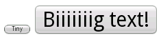
Notice how the width and height of the button varies with the text, and the background image stretches to accommodate it.
Another Example for clarification :
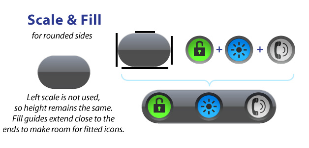
1-pixel black lines drawn on the edge of your image that define the scaling and fill of your image.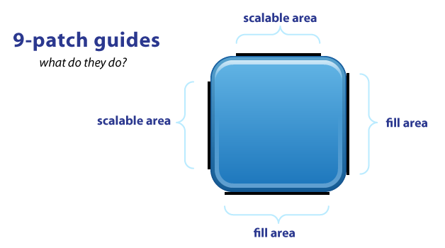
The TOP and LEFT guides are used to define the scalable portion of your image.The button can stretch horizontally and vertically within the black portion and the corners will remain the same size.The allows you to have buttons that can scale to any size and maintain a uniform look.
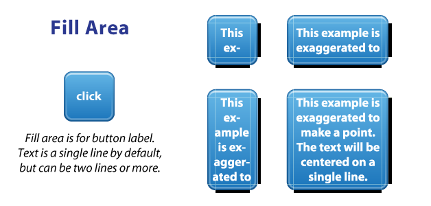
9-patch isn't just for buttons, it works for background images as well.
Finally, here's a good demonstration of how scale and fill guides can vary, such as a LinearLayout with a background image & fully rounded sides: